

A room usually has fixed walls. If you want your room to look bigger, you can alter its appearance by removing the walls to create a new open floor plan. But if you don’t have the budget for remodeling, the cost-effective alternative is to make your room look spacious with interior painting.
You can achieve this by the judicious use of colors and shades, although you can use textures or patterns as well. Experience top-rated residential painting services that cover interior, exterior, and specialty finishes.
Color’s impact on room size perception
The perception of room size can be significantly influenced by the colors used on walls, ceilings, floors, and even furniture and décor. Colors affect how light interacts with a space, creating optical illusions that can make a room feel larger, smaller, narrower, or wider.
Ways to make your room appear larger with color
The impact of color on room size perception is a fascinating aspect of interior design that relies on how our eyes and brains interpret visual stimuli. The right paint color can make a room feel more spacious, airy, and open, even if it’s physically small. Below is an in-depth exploration of how to make a room appear more expansive using color:
1. Light colors and their expansive effect
- Why they work: Light colors reflect more natural and artificial light, which helps to create a sense of openness. They make the walls recede visually, creating the illusion of a larger space.
- Ideal choices:
- Whites: Pure white or off-white is a classic choice for maximizing the perception of space.
- Light grays: Soft grays can add sophistication while keeping the room airy.
- Pastels: Soft blues, mint greens, blush pinks, and lavender tones create a light, spacious feel while adding a touch of color.
- Neutral tones: Beige, cream, or taupe are excellent for achieving a warm, open vibe.
2. Monochromatic color schemes
- Why they work: Using varying shades of the same color minimizes visual breaks, creating a seamless flow that tricks the eye into perceiving continuity.
- Application tips:
- Paint walls, trim, and ceilings in similar tones, with only slight variation in shade to add subtle dimension.
- Incorporate furniture and decor in matching or complementary tones to extend the monochromatic effect.
3. Cool colors for depth
- Why they work: Cool colors like blues, greens, and purples tend to recede, which gives a sense of depth and makes walls feel farther apart.
- Best shades:
- Pale blue or aqua for a fresh, coastal feel.
- Soft green for a natural, calming effect that opens up the space.
- Light lilac or lavender for a modern and airy aesthetic.
4. High-contrast ceilings and walls
- Why they work: A lighter ceiling color than the walls draws the eye upward, making the room feel taller and more spacious.
- Application tips:
- Use a soft white or a lighter version of the wall color for the ceiling.
- Choose semi-gloss or satin finishes on the ceiling to enhance light reflection.
5. Horizontal and vertical illusions
- Why they work: Stripes or gradients create a sense of direction, influencing how we perceive the room’s dimensions.
- Applications:
- Horizontal stripes can make a room appear wider by elongating the walls.
- Vertical stripes can make the ceiling seem higher, giving the room a larger feel.
6. Emphasizing natural light
- Why it’s essential: Maximizing natural light works hand-in-hand with paint color to brighten and enlarge a space.
- Color choices:
- Reflective colors like whites and soft yellows amplify natural light.
- Avoid dark or matte shades near windows, as they can absorb light and shrink the perceived size.
7. Accentuating with accent walls
- Why they work: If done correctly, a well-placed accent wall can create depth and make a room feel larger.
- Application tips:
- Choose a darker or bolder color for one wall while keeping the others light. This will draw the eye and create the illusion of depth.
- Ensure the accent wall receives ample natural light to avoid making the room feel closed off.
8. Gloss and finish
- Why they work: The finish of your paint influences how light interacts with the room.
- Best finishes:
- Use satin or eggshell finishes for walls to reflect just enough light without being too shiny.
- Glossy finishes on ceilings or trim can further enhance light reflection and contribute to the perception of spaciousness.
9. Open plan tricks
- Why they work: Consistency in color throughout open-plan spaces creates a cohesive and expansive look.
- Application tips:
- Use the same light neutral tone across connected rooms to avoid visual boundaries.
- To add interest without breaking the flow, consider subtle variations in texture (e.g., matte walls with glossy trim).
10. Avoiding cluttered or dark colors
- Why they work: Dark or highly saturated colors can make walls feel closer, shrinking the room.
- Tips:
- Reserve darker shades for small accents or furniture instead of walls.
- Avoid too many contrasting colors, as they can break up the space visually.
Practical examples
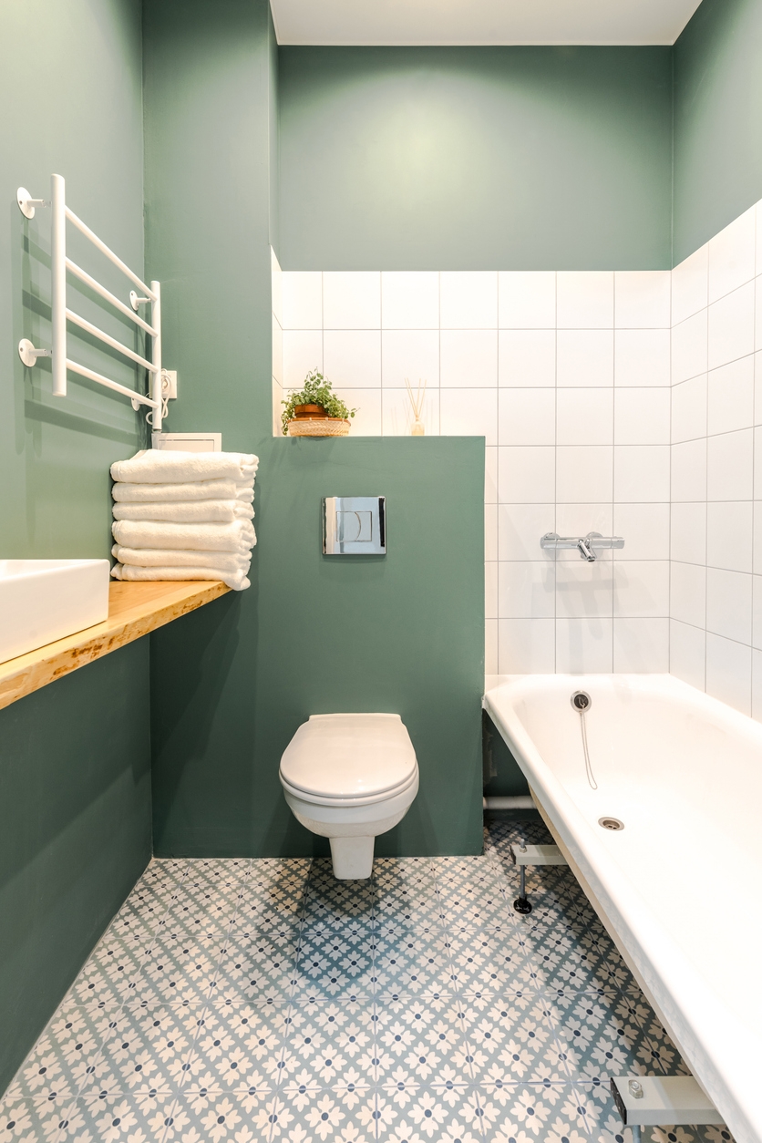
- A small bathroom painted in soft aqua with white trim can feel like a serene retreat.
- A tiny bedroom with pale gray walls and a white ceiling can create a restful, open atmosphere.
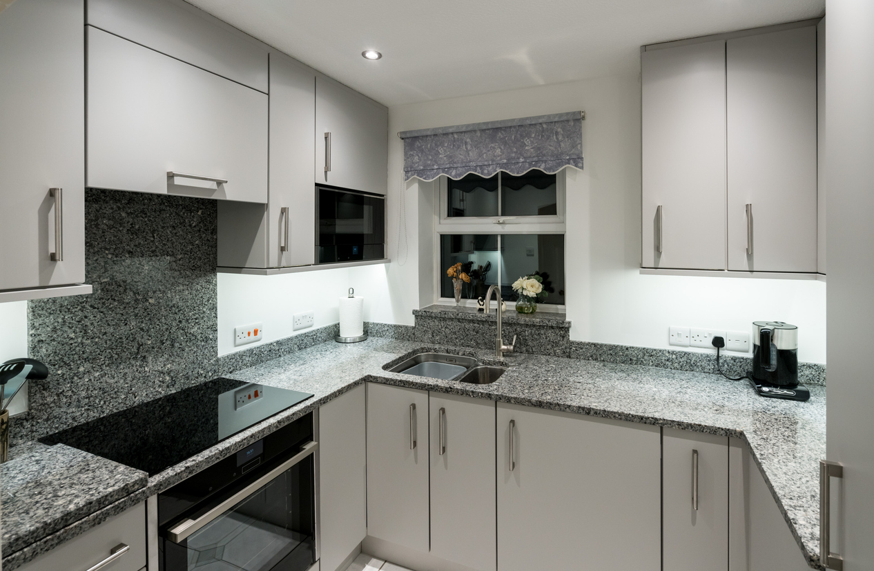
- Using pale sage green in a kitchen can add a touch of freshness while making the space feel larger.
By applying these principles thoughtfully, even the smallest room can be transformed into an inviting, open-feeling space.
The use of textures for a room’s perceived spaciousness
Textures can significantly impact the perceived spaciousness of a room. Using textures affects how light interacts with surfaces and influences visual depth, potentially altering the sense of space. Here’s how textures play a role:
1. Smooth textures for expansiveness
- Smooth surfaces, such as glossy walls or polished furniture, reflect light more evenly and create a sense of openness and brightness.
- These textures can make a room feel larger, as they minimize visual clutter and allow the eye to glide across surfaces uninterrupted.
2. Textured surfaces for coziness
- Textured surfaces, like rough stone, wood grain, or patterned wallpaper, add depth and warmth to a space.
- While they can make a room feel cozier, excessive or overly complex textures may make a small room feel busier and, therefore, smaller.
3. Strategic use of texture
- Accent walls: Adding texture to a single wall can create a focal point without overwhelming the space. For example, a brick or shiplap wall can add interest while keeping the rest of the room smooth and open.
- Ceilings: Textured or beamed ceilings in small rooms can lower the perceived height, making the space feel more intimate. Conversely, smooth or high-gloss ceilings can reflect light upward, enhancing the sense of height.
4. Soft textures for depth
- Fabrics like linen curtains or plush rugs introduce softness that enhances a sense of comfort without reducing spaciousness.
- Use light-colored or monochromatic textures to maintain an airy feel.
5. Contrast and balance
- A balance of textured and smooth elements ensures that the room feels dynamic without sacrificing the sense of space. For example, pairing a textured area rug with sleek furniture maintains openness while adding visual interest.
Parting words
The sensible use of colors, patterns, and textures can make your room look more spacious without physically altering it. These clever tricks can help you maximize the perception of space in your home, making even the smallest of rooms feel more expansive and welcoming.
For more expert paint tips or professional assistance, feel free to contact our team at Custom Painting, Inc. at 925-294-8062 or on our contact page. Serving the Bay area including the cities of Mountain View, Newark, Orinda, Pleasant Hill and Pleasanton.