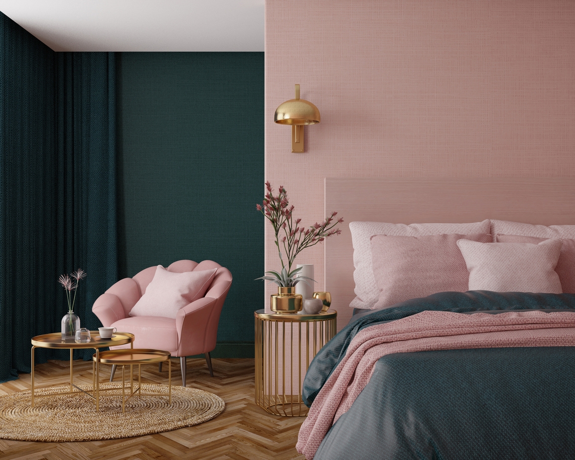
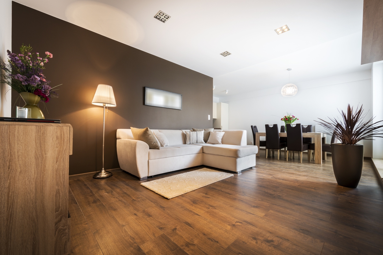
Painting is a relatively quick and cost-effective way to refresh your space. With just a new coat of paint, you can transform a plain, boring room into something unique.
While choosing interior colors is highly subjective, and there’s no right or wrong way to do it, many homeowners struggle because their chosen colors don’t complement each other. Factors like room size and natural lighting are often overlooked, leading to unsatisfactory results. However, selecting a color scheme doesn’t have to be intimidating. Here are some suggestions to help you create a no-fail interior color scheme.
Look for Inspiration for Your Color Scheme
Choosing a color scheme can be as simple as looking around you and drawing inspiration from the things you love. Start by considering personal items like artwork, furniture, or fabrics. For instance, your favorite painting might have a beautiful palette that you can mimic in your room. A beloved rug from a past trip can provide a unique blend of colors, while the shades of your favorite flowers can inspire a fresh, natural look.
Another great source of inspiration is nature and your surroundings. The colors of the beach, a forest, or even your backyard can offer harmonious combinations that feel natural and soothing. Think about how the greens of leaves, the blues of the sky, and the warm tones of soil can be integrated into your space.
Your favorite places or vacation spots can also serve as excellent color references. Whether it’s the vibrant colors of a tropical beach or the muted tones of a mountain retreat, these places can evoke memories and emotions that you can bring into your home.
Once you’ve found your inspiration, identify specific shades within these items and incorporate them into your decorating choices. Pay attention to the proportions of each color to recreate a balanced and cohesive scheme. This approach ensures that your color scheme feels personal and thoughtfully curated.
Consider Colors from Existing Room Elements
When choosing a color scheme, it’s essential to consider the colors already present in your room. Start by examining your furniture and décor. These pieces often have dominant colors that can serve as a foundation for your overall color palette. For instance, if you have a navy blue sofa, you might consider complementary colors that highlight or contrast with this shade.
Next, look at your flooring and cabinetry. These elements cover significant portions of your room and thus substantially impact your color choices. If you have wooden floors, you might choose colors that complement the warm tones of the wood. Similarly, for cabinetry, especially in kitchens and bathrooms, consider how the colors will interact with your cabinets’ finish and style.
Architectural features, such as crown molding, wainscoting, or exposed beams, can also influence your color scheme. These features often have a distinct style or color that should be integrated into your overall design. For instance, white crown molding can provide a crisp contrast to more vibrant wall colors, while exposed wooden beams might inspire a more rustic or natural palette.
Consider What Feeling You Want the Room to Evoke
When choosing a color scheme, it’s crucial to consider the mood you want to create in the room. Different colors can evoke different feelings and atmospheres.
Calm and relaxing
If you aim for a serene, spa-like ambiance, opt for cool colors such as blues, greens, and soft neutrals. These hues are ideal for bedrooms and bathrooms where tranquility is key. Light shades can also make a space feel more open and airy, enhancing the relaxing vibe.
Energetic and vibrant
Choose bold and bright colors like reds, oranges, and yellows for a lively and energizing space. These colors are perfect for areas where activity and social interaction are encouraged, such as living rooms, kitchens, and playrooms. Bright accents can stimulate creativity and conversation.
Warm and cozy
To create a warm and inviting atmosphere, consider using warm colors such as rich browns, deep reds, and golden yellows. These shades work well in spaces where you want to feel comforted and snug, like dining rooms and family rooms. Warm tones can make a large room feel more intimate and welcoming.
Consider the Amount of Natural Light Entering Your Space
Natural light has a significant impact on how colors appear in your space, influencing their brightness, warmth, and overall effect. Natural light can make colors look different at various times of the day. Morning light is typically cooler, while afternoon light is warmer. Consider this when choosing your color scheme, as it can change the perception of the hues you select.
Opt for brighter and more vivid colors for rooms that lack natural light. Lighter shades reflect the available light, making the room more open and inviting. Consider using mirrors and other reflective surfaces to amplify the effect.
If your space receives a lot of natural light, choosing darker or more muted colors can help balance the brightness. This approach reduces glare and creates a softer, more comfortable environment. Conversely, in light-deprived rooms, brighter colors can create a sense of warmth and illumination.
Use the Color Wheel
When in doubt about choosing a color scheme, the color wheel can be your best friend! Here are three different types of color schemes to consider:
Monochromatic color scheme
A monochromatic scheme involves using different shades and tints of a single color. For example, you can paint your entire room in various shades of blue. This creates a clean, uniform look. To add some interest, incorporate a pop of color, like metallic accents, to break up the monotony.
Analogous color scheme
Analogous colors are next to each other on the color wheel, creating a harmonious look. For instance, a red, orange, and yellow scheme brings a warm, cohesive feel to a room. These colors naturally complement each other and are pleasing to the eye.
Complementary color scheme
Complementary colors, such as yellow and purple, are opposites on the color wheel. This scheme creates a lively and dynamic look due to the strong contrast. When using complementary colors, choosing one color for the walls and another for accents is often effective. To soften the contrast, you can opt for muted shades of the complementary colors, maintaining the balance without overwhelming the eye.
Explore the Latest Color Trends
Keeping up with the latest color trends can be a fun way to refresh your home’s look. Here’s how you can incorporate these trends effectively:
Adapt current popular colors and combinations.
Popular colors change with the seasons and design trends. Currently, earthy tones like terracotta, sage green, and warm neutrals are in vogue. Pair these with rich, deep blues or muted pinks for a trendy yet sophisticated look.
Incorporate trendy colors into your home.
Start small by adding trendy colors through accessories like pillows, throws, or artwork. If you feel adventurous, try an accent wall or a piece of furniture in a trending hue. This allows you to embrace new trends without committing to a complete room makeover.
Balance trends with timeless choices.
To ensure your space remains stylish over time, balance trendy colors with timeless choices. Classic shades like white, beige, and gray can provide a neutral backdrop that highlights trendy accents. This way, you can easily update your space with minimal effort as trends evolve.
Conclusion
Choosing the right color scheme for your home can transform your space, making it more inviting and reflective of your personal style. Whether you’re drawing inspiration from personal items, considering existing room elements, or exploring the latest trends, the possibilities are endless.
If you need a hand for your house painting project, contact Custom Painting, Inc. for expert advice and professional painting services. Let us help you create a space you’ll love! Call us at 925-294-8062 so you can get started.


